Forgetting our log-in credentials happens all the time. Resetting our password or going through every e-mail account and password combination until we get it right it's fairly common.
On mobile is even more frustrating because it's harder to type due to screen and keyboard limitations. In this article we are going to propose an innovative way to solve these setbacks with some magic.
Sign in can either be a painless or a very frustrating experience. Log-in is fundamental for most of the apps that need to authenticate users. It can really hurt your business if your logging system isn't the most functional one.
User interface engineering’s survey discovered that 45% of all customers had multiple registrations in the system, some as many as 10. They also realised that 160,000 users requested their passwords per day and that 75% of these people never tried to complete the purchase once requested. Fixing their logging system enabled them to increase their revenue in $300 Million.
So, yeah, this is a big deal. Nowadays, designers and developers have to design interfaces to cope with security and UI requirements so the user doesn’t give up on signing in due to logging problems.
Social Login
We’ve all seen changes in recent years that made the mobile UX easier for log-in. One big change, especially due to its usability, was “Social Login”.
Today, almost everyone has a social media or e-mail account. Hence, apps and websites started to incorporate buttons to log-in using Facebook, Twitter or Google account through CAS.
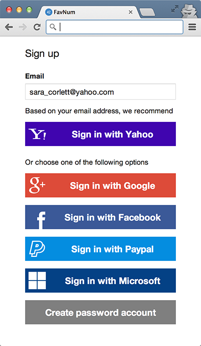
Login with third-party services
The idea behind it's that the user only needs to log-in once in one of these services. The authentication is then shared through the websites that support the protocol. The user only has to click on a button that signs him.

Although this can simplify the process, especially on mobile because the user only needs to tap a large button, there are some caveats that Mailchimp noticed.
Social login isn't worthy
First of all, the problem of knowing which credentials were used before still remains because the user might and probably will have a Facebook, Twitter and Google Account. “How did I log-in last time? Did I use Facebook or did I just sign in with a normal account?” one may ask.
Signing in with the wrong service results in a duplicated account, a frustrated user and more dummy data in your platform.
Secondly, you’re delegating the authentication process to a third-party. Although it’s unlikely to happen, what if one of these services get’s hacked? Not to mention that you are adding more buttons/options to the screen.
Last but not least, the fear of having their social information abused can hold back your users from using the social buttons completely. Mailchimp discovered that only 3.4% of their users actually logged in with Facebook or Twitter.
Mobile's special requirements
Besides UI requirements we also have to deal with security ones. Since it became easier and easier for computers to crack passwords, we started to use more complex passwords. Today’s security requirements recommend passwords with:
- Length - the longest the better (at least 8 characters)
- Complexity - lower and upper case alphabets, numbers and special characters
- Uniqueness - do not create passwords which are similiar with old ones in any way
The problem of using secure passwords is that smartphones weren't made for writing complex things on such small screens, especially if your password is T%Bc6FU+c8T?#d{R.
Sure, there are Password Managers software that take care of safely storing and generating complex passwords. Nevertheless, you must incorporate these software libraries in your app. What if the user doesn’t use the one software that you incorporated?
Introducing: One-Click Login
A breath of fresh air has recently reached our devices on ways to login. If you are a Slack user you probably noticed their innovative way to log-in through a magical button.
Amazing right? Basically the user taps on a button that will send an email to the user’s secured email client to authenticated him. The user then opens the email and taps on an embedded link to open Slack again. Boom! Just like that, the user is authenticated because has proven to be the owner of the email address.
Like Social Login buttons, the user only needs to tap on buttons available in the screen to log-in. The difference is that there is only one alternative for the user. Hence, unlike Social Login, the user will not hesitate about which option was used before.
Not only that, but this option can be used by the user again and again because it's not going to create duplicated accounts. The email either exists or it's a new account, and the user should be informed about that. Better error messages are key for improving password reset issues like Mailchimp realised.
Additionally, the user keeps his social media account away from log-in. Thus, there is no concern about abusive use.
Moreover, regarding security, we restrict the point of failure to a single point or service – the email account. Emails giants like Google and Microsoft have very strong security measures, including two-factor authentication.
Concluding, we have the best of all worlds in a single and easy to use solution.
The secret behind magical log-in buttons
Despite seeming like magic, it’s not actually magic. The secret behind this “One-Click-Login” UX, as we like to call it, is Deep Linking technology. It’s quite simple.
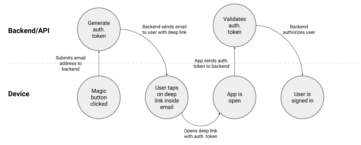
First you ask the user’s email address. Then, you implement an on-click event handler that is going to send the user's email address to your backend. This will generate an authentication token that is going to be saved on your backend to be validated later on. Finally an email is sent to the user’s email address with a special link in it.

The special link is a deep link that opens your app and calls a specific validation method that is expecting an authentication token, e.g. myapp://login/A3Ehr9z9e. Tapping on the special link calls the validation method, which will validate the authentication token against the backend. If everything is valid you can then authorise your user and redirect him to the right view.
Add magical log-ins to your app
We think that this feature is great. That’s why we decided to make it easier to implement it using HOKO’s mobile deep linking SDK. If you are already using our SDK, then you are almost done with it. If you are not, it’s easy too. Integrating our SDK only takes about 20 minutes and in the end you have your app ready to handle any kind of deep link.
Instead of using regular deep links we are going to use HOKO smart links. These have the advantage of working across devices. Hence, you can log-in in your smartphone and desktop using the same method.
By the way, you don’t need to call any API to generate smart links. You can integrate Lazy Smart Links with One-Click-Logins. These allows you to create smart links on-demand just by writing a HTML hyperlink with a special format, like http://myapp.hoko.link/lazy?uri=login%2Fq5w6e7r2t4y.
The smart link will work across email clients by opening your app immediately if you have iOS 9 Universal Links or Android M App Links configured. Otherwise, it is going to be launched through the browser.
Keep in mind that this is not a silver-bullet solution. It should not be the only way to log-in because old fashion users might be reluctant to use it. Hence, it's a great alternative to the traditional way of logging and avoid having your users constantly asking for resetting their password and with problems entering their passwords.
Read our in-depth tutorial to know how easy it is to implement magical log-in buttons on your app using HOKO. Drop us a message or leave a comment below if you have questions or feedback regarding this or other matter. We are always happy to hear from you.
Additional resources
- Casino Utan Spelpaus
- Casinos Not On Gamstop
- Casino Not On Gamstop
- Casino Not On Gamstop
- Non Gamstop Casino
- Non Gamstop Casinos UK
- Casino Online Non Aams
- ολα τα Online Casino
- Canadian Online Casinos
- Casino Sites Not On Gamstop
- Best Non Gamstop Casinos
- Casino En Ligne
- UK Online Casinos Not On Gamstop
- Non Gamstop Casino UK
- オンラインカジノ 日本
- Non Gamstop Casino
- Non Gamstop Casino Sites UK
- Meilleur Casino En Ligne France
- Meilleur Site De Casino En Ligne
- Non Gamstop Casino UK
- UK Betting Sites
- UK Casinos Not On Gamstop
- Best Betting Sites Not On Gamstop
- Non Gamstop Casino
- Migliori Casino Online
- Migliori Siti Casino Non Aams
- Meilleur Casino En Ligne Belgique
- Top 10 Casino En Ligne Belgique
- Siti Scommesse Non Aams
- Meilleurs Site De Paris Sportif
- 파워볼사이트
- лучшие онлайн казино
- Casino En Ligne Argent Réel
- Casino En Ligne France
- Migliori Casino Online Italia
- Casino En Ligne Belgique
- Meilleur Casino En Ligne 2026
- Casino En Ligne Crypto
- Casino Non Aams Italia
- Olympe Casino Bonus Sans Depot
- Casino En Ligne Le Plus Payant
